
Apple's Device Mockups Are All the Wrong Size
An iPhone is not as big as a MacBook. Apple’s own design assets disagree.
I’d downloaded the official Apple Design Resources device frames — the clean PNG mockups of every current iPhone, iPad, Mac, and display — to drop a few of them into one image. The plan was a simple to-scale family shot: laptop, tablet, phone, sitting next to each other the way they would on a desk. Instead I got this:
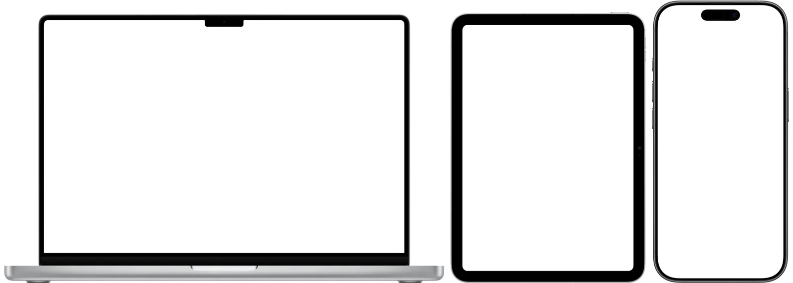
The iPad stands nearly as tall as the 16-inch MacBook Pro. The iPhone isn’t far behind. Place them at their downloaded sizes and the phone reads like a small tablet and the tablet like a laptop. Every relative proportion is wrong.
Why the raw files lie
The pixel dimensions of these assets have nothing to do with physical size. Each frame is exported at its device’s native screen resolution:
- iPhone 17 Pro Max portrait: a 1320 × 2868 panel in a 1470 × 3000 frame
- iPad Pro 13": a 2064 × 2752 panel in a 2300 × 3000 frame
- MacBook Pro 16": a 3456 × 2234 panel in a 4260 × 2840 frame
A phone screen and a laptop screen have a roughly comparable number of pixels, so their image files end up a roughly comparable number of pixels tall — even though one device is the size of your hand and the other spans your lap. There’s no DPI metadata to save you either; the files are nominally 72 dpi, so the app you drop them into can’t infer real-world size. The pixels encode resolution, not inches.
To composite them correctly, every image has to be rescaled so the same number of pixels represents the same real-world distance. The question is what to measure.
The dead ends
My first three instincts were all wrong, and instructively so.
Just do the math on the file dimensions. This fails because the device doesn’t fill its frame, and the empty margin around it is not a constant. Trimming the transparent padding showed the iPhone frame is ~97% device, but the MacBook frame is only ~91% device — there’s a tall band of empty space and soft shadow under the laptop. Scale by the raw canvas and the MacBook lands ~10% too small relative to the phone. The padding is per-asset; there’s no single divisor.
Set the DPI correctly and let the app handle it. DPI changes an image’s declared physical size (pixels ÷ dpi = inches), which matters for print. But when you drag a layer onto a canvas in Pixelmator or Photoshop, it places by pixels and ignores DPI entirely. Stamping metadata doesn’t make two layers line up in a pixel-based composition. Resizing does.
Trim to the device body and scale by that. Closer — but the device body is the wrong ruler. Its edges are rounded, and it’s wrapped in a soft drop shadow whose extent varies wildly. The phone’s shadow is tight; the open laptop’s shadow is a big diffuse pool. Measure “the device” and you’re really measuring “the device plus an inconsistent amount of shadow.”
The screen is the ruler
These frames are designed for compositing your own screenshot into them, which means the screen is a transparent cutout. The pixels inside the display are effectively alpha = 0, the bezel around them is effectively opaque, and the boundary between has just a hairline of anti-aliasing. That’s the cleanest edge in the whole image: a hard transparent-against-opaque line, no rounding, no shadow.
And here’s the load-bearing fact that makes the cutout more than just a clean edge. The physical dimensions of every Apple display are published — Apple’s device spec sheets give each panel’s active area down to the millimeter. So if I can measure the screen in pixels, I can divide by a number Apple already prints.
Then the part that made me stop and check my work twice. I measured the transparent aperture on three devices:
| Device | Measured aperture | Native screen resolution |
|---|---|---|
| iPhone 17 Pro Max | 1320 × 2868 | 1320 × 2868 |
| iPad Pro 13" | 2064 × 2752 | 2064 × 2752 |
| MacBook Pro 16" | 3456 × 2234 | 3456 × 2234 |
The aperture is the device’s exact native resolution. The screen is rendered at 1:1. So the cutout is not just the crispest ruler in the image — it’s a ruler with known real-world units printed on the side: measure the transparent rectangle, divide by the published panel size, and you have true pixels-per-millimeter for that render.
There was a bonus in that table. I’d worried the laptop would be a problem: if the MacBook were drawn at a three-quarter angle, its screen would be foreshortened and useless for measuring. But the aperture came back as a clean 3456 × 2234 — exactly native, no foreshortening. The MacBook’s screen plane is rendered flat-on, same as the phones (hold that thought — the rest of the laptop is not, and that’s the one caveat at the end). One method would cover everything.
The pipeline
The whole thing is ImageMagick. For each asset:
1. Find the screen aperture. Take the alpha channel, keep only the fully-transparent pixels — this -threshold 95% step is what excludes the semi-transparent shadow, the exact thing that wrecked my body-trim attempt — then label the connected regions and pick the largest one that doesn’t touch the image border. The exterior margin touches the border; the screen doesn’t. The Dynamic Island and notch come back as their own smaller regions and get ignored.
magick "$f" -alpha extract -negate -threshold 95% \
  -define connected-components:verbose=true \
  -define connected-components:area-threshold=2000 \
  -connected-components 8 null:
2. Convert to a physical scale. Divide the aperture’s long edge (px) by that device’s published screen long-edge (mm) to get pixels-per-millimeter for this specific render.
3. Normalize to a shared scale. Take the minimum px/mm across the whole set as the common target, so every image only ever scales down — no upscaling, nothing gets soft. For this batch that landed at 8.29 px/mm (≈ 211 dpi). Resize each full, uncropped frame by its own factor and stamp the matching DPI so the files are correct for print too.
The reason this measures each file instead of reading from a hardcoded lookup table is the whole point: it’s self-calibrating. If any asset was exported at an odd scale, the aperture measurement catches it on the spot instead of silently propagating a wrong assumption — which is the answer to the obvious “why not just tabulate every device’s PPI once?” objection. I ran it across the entire asset set, not just the three rows above, and every aperture matched the device’s native resolution.
Here’s the same three devices afterward:
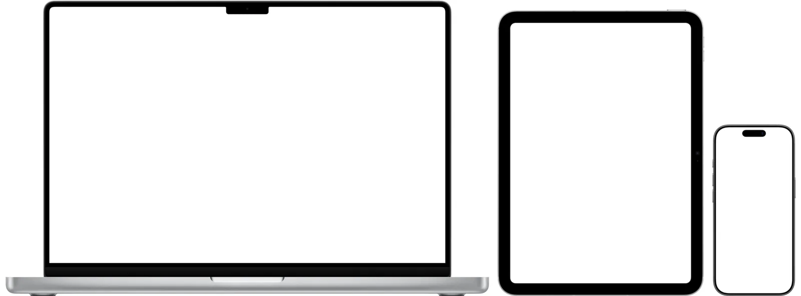
The iPad is now plainly a tablet, the iPhone plainly a phone. To check it, I trimmed each normalized image back down to its visible device and divided that height in pixels by the shared 8.29 px/mm. For the flat devices — phones, iPads, the iMac, the Studio Display — the implied real-world height landed within half a percent of Apple’s published dimension every time.
The one honest caveat
The laptops have an asterisk, and it’s worth stating plainly because it’s a property of the source art, not a bug you can fix.
Their screens are dead-on — that’s the flat-on plane the aperture measured. But the rendered keyboard deck sits in the foreground, closer to the camera than the screen plane, so perspective magnifies it. Measure the visible laptop footprint width against the published body width and it comes out about 18% large. There is no single “correct” scale for a perspective render placed next to flat-on devices: match the keyboard and the screen goes too small; match the screen and the deck goes a touch large. I anchored on the screen, because the screen is how a human actually compares “how big is this device” — and it’s the part that’s rendered honestly. The laptop will look ever so slightly generous in its footprint, and that’s the most defensible answer available.
The rest of it, though, is exact. The trick was refusing to eyeball a fudge factor and instead finding the one feature in the image that was simultaneously pixel-perfect to measure and physically documented. It was hiding in plain sight — it was the empty rectangle in the middle of every frame the whole time.
What else in your toolchain are you eyeballing with a hand-tuned constant, when there’s an exact, already-documented measurement sitting one property away?